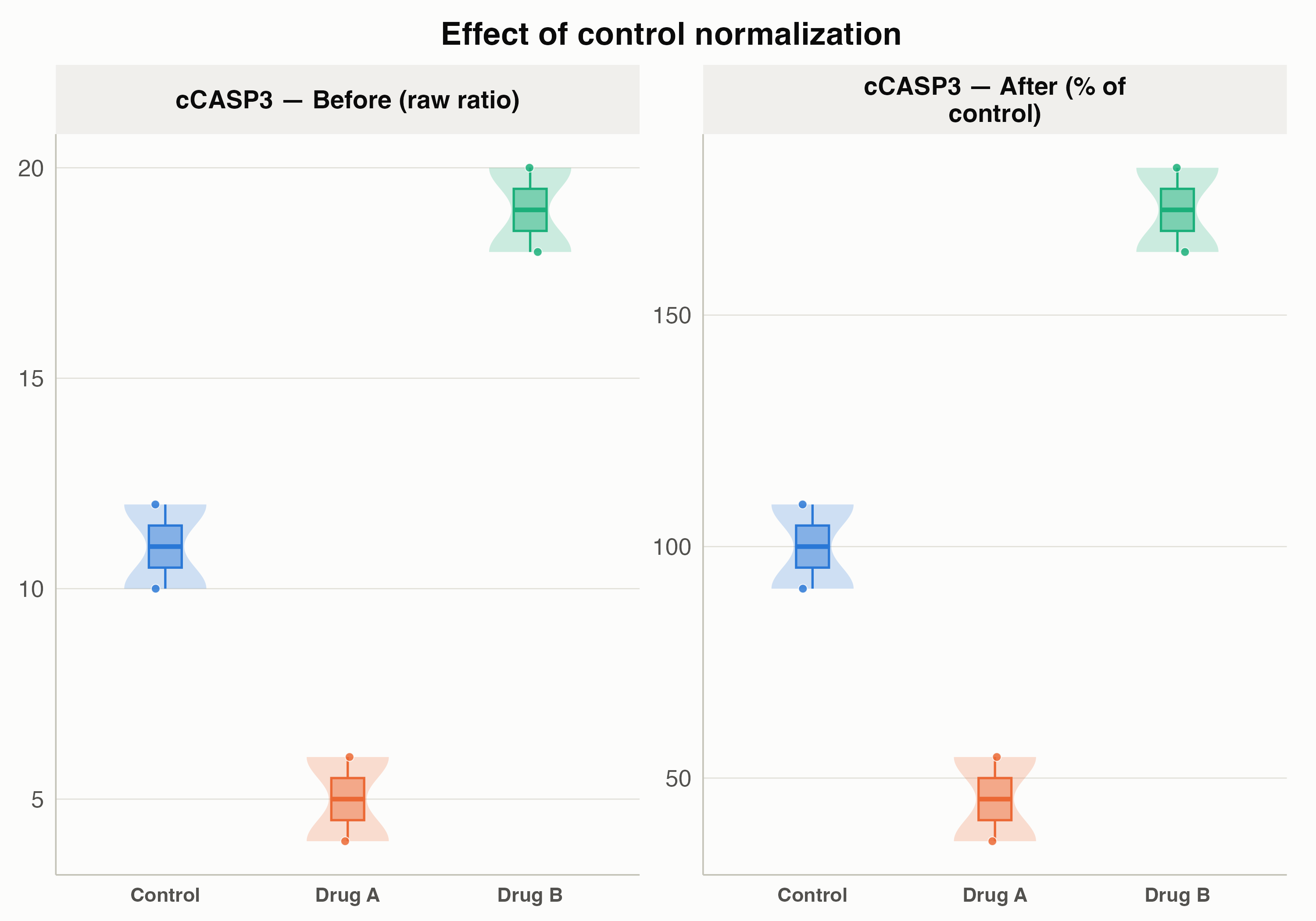
Plot the raw values next to the normalized values, before and after
Source:R/normalization.R
plot_normalization_before_after.RdShows the raw marker ratio (before) side by side with the percent-of-control
value (after normalize_to_control()), one pair of panels per marker, so you
can see at a glance what control normalization did to the data.
Arguments
- .data
Data frame that has been through
normalize_to_control()on the long format (must contain "marker_positivity_ratio", "pct_of_control", "marker_positivity" and a treatment column).- treatment_column_name
Column holding the treatment label. Defaults to "Treatment".
Examples
df <- data.frame(
  PID = "PID1",
  Treatment = c("Control", "Control", "DrugA", "DrugA", "DrugB", "DrugB"),
  marker_positivity = "cCASP3",
  marker_positivity_ratio = c(10, 12, 4, 6, 18, 20)
)
normalized <- normalize_to_control(df)
plot_normalization_before_after(normalized)